Nature and Human Nature
By Max Levy Texas Architect Magazine September 2011
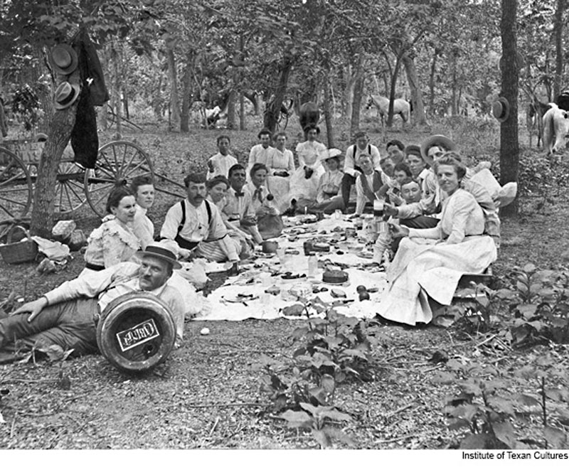 Our 19th century Texas forebears lived more closely with nature than we do, but of course they had little choice in the matter. Though we sometimes romanticize this close relationship, most of them would probably have traded the romance for a window unit air conditioner. Nevertheless they made the most of their situation and there remains much that we can learn from them about the intersection of daily lives, architecture, and nature. It may be helpful to look at a few remarkable buildings from their world and measure these against our current well-meaning attempts at architectural alliance with nature.
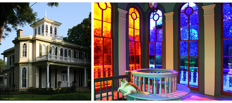 Since 1872 a unique room in Jefferson, Texas, has come alive with light each morning. The roughly twelve foot cube of space crowns the top of an Italianate wooden mansion. Uncharacteristic of its age, the room’s walls are mostly glazed. The sunrise is received through a wall of red stained glass on the east, the south wall is glazed in green, the north wall in blue, and the west wall intensifies sunsets through orange glass. Imagine the changing mixtures and nuances of light in this room over the course of a single day. Known as the House of the Seasons, there is no written record of the architect’s design intent, only the self-evident architectural joy that results. An opening in the center of the floor surrounded by a balustrade permits the reservoir of colored light to trickle down into the central hallway of the house’s second floor, and then on down through another opening to the first. Though one might wish these openings to be larger, permitting a freer flow of light, a certain inspiration comes through to us nevertheless. We are reminded in our own work to lift our gaze so-to-speak, to think a little more about light and a little less about lighting.
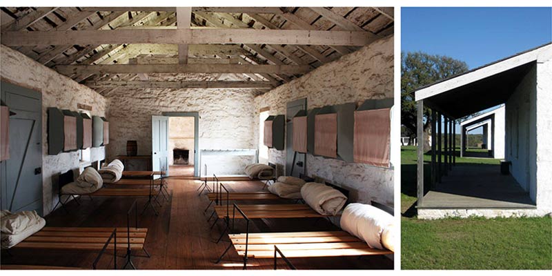 To get to Fort McKavett one drives long straight stretches of road that vanish over the western horizon. Established in 1852, it is composed of slender, gabled stone rectangles, spaced apart to comb the breezes. Unlike other forts that defined the western edge of Anglo settlement, this one’s stone walls were whitewashed. The modern eye is arrested by these elementary white forms, chiseled by sunlight on an arid rise. Because of the linear nature of the buildings, rooms, and galleries, and because of the way their windows and doors align for cross ventilation, the compound’s interior and exterior spaces seem interwoven. To loom interior and exterior space is at odds with the contemporary drive to consolidate life into ever larger single buildings on the basis of energy and material efficiencies. While it is true that a huge building can swallow up any function, the results are generally unsatisfying. By contrast, walking through Fort McKavett’s long skinny buildings today, one can imagine almost any function being pleasantly accommodated there: a school, a corporate headquarters, a hotel, an institute of almost any kind. But what about those energy and material efficiencies referred to above? The benefits of pumping a massive building full of unending air-conditioning and artificial light are questionable compared to linear buildings where artificial lighting may be dramatically reduced, and where opening up to mild weather (turning off mechanical equipment periodically) can be done with ease. We Texans lament our punitive summers, our meager falls and springs, our winter cold spells. But the fact is, we have parts of days, and full days, and weeks that altogether constitute about five or six months’ worth of mild weather over the course of a year. There is something of both environmental and human value in turning off the climate machines occasionally.
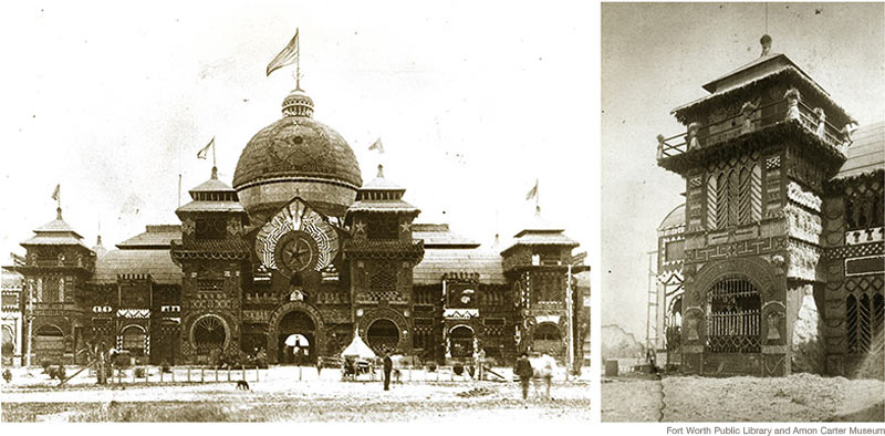 There is widening agreement today that a building’s materials should be both sustainable and procured from within five hundred miles of a building’s site. Surely no structure will ever surpass the degree to which the Texas Spring Palace satisfied these strivings. Standing as the southern terminus of Fort Worth’s Main Street in 1889, this enormous trade exposition hall presented every conceivable product from across the state. The presentation was not limited to displaying products within the hall, but extended to the architecture of the building itself. Its wooden structure and siding came from the forests and mills of East Texas, then sheathed entirely by a crazy quilt veneer: from Texas farming counties came wheat sheaves, corn, alfalfa, cane, and cotton; the state’s prairies and hills contributed cacti, coal, and pelts; boxcars of seashells arrived from the Texas coast; and ranching counties sent cattle hides, horns, and skulls. The completed structure was savage but resplendent, the architectural equivalent of a Plains Indian headdress. Before its spectacular demise, a legendary fire in its second year, the building was the center of state festivity and a national tourist attraction. Ultimately, whatever it lacked in durability it more than made up in exuberant visual partnership with nature.
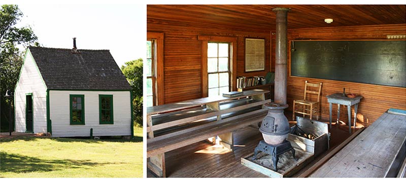 Picture a drawing of a square with a dot in the center of it. This is the plan diagram of the Bairfield School, a one room schoolhouse built in the 1890’s. It was moved several times over the years from one isolated ranch to another in Donley County, landing finally at the Ranching Heritage Center in Lubbock. The square in the drawing represents walls, and the dot is a pot bellied stove. It is about as close as Panhandle ranchers could come to replicating in their own way a Comanche teepee cupped over a campfire. Winter months were the schooling time for ranch kids, and keeping warm out on the high plains became a point of orientation. Heat radiates outward from the dot. Natural light radiates inward from the square. Exterior wood siding painted white gives way to interior wood siding finished clear, as though the materials themselves warm near the building’s core. The self-sufficiency of this stoic little box on the prairie suggests a fundamental architectural cell. The mind moves to the idea of larger buildings that are cellular, like the Kimbell Art Museum, where the cells are based not soley on energy efficiency but have something of the heart bred into them as well.
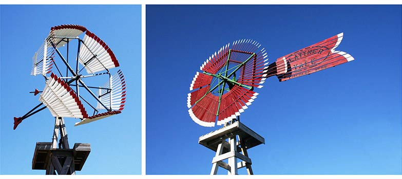 The last example to be considered here was not actually a building, but it was a common part of 19th century life constructed of architectural materials: the windmill. Accompanying enterprises of every variety in town and country, windmills often commanded more attention than any other buildings in their vicinity. How could one not be attracted by their motion, their ingenious mechanisms and details, their stature, structure, and intricate silhouettes against the sky? To these traits must be added their lively painted color schemes, and aesthetic flourishes of shaped rudders and cast counterweights. Eight foot diameter wheels were the smaller ones, and they commonly ranged in diameter upwards to twelve, sixteen, twenty, and even thirty feet. These wheels, constructed of finely tapered wood slats, were like great kinetic trellises, moving in unison with currents of the winds. What is so striking to us today about these technological relics is that they were at once indispensible utilitarian devices, yet were objects of visual delight. Blurring the line between utility and poetics is actually a very American thing extending back to Thomas Jefferson’s ingenius details at Monticello, and to Thoreau’s blending of practicality and poetics at Walden.
Our collective instinct and alarm about the decline of our natural habitat is correct and timely. It is good that we are focusing attention on improving energy savings, water efficiency, reducing CO2 emissions, and stewardship of natural resources. It is not good however that our efforts in this regard seem to be distancing us from nature: energy-saving sources of illumination whose light quality is depressingly unnatural; massive buildings that draw us deep and away from outside; composite materials touted as green, yet entirely denatured; buildings so obsessed with air tightness and mechanical efficiency that they appear oblivious to land, sky, and weather; and sustainability bureaucracies that burden architects to the point that they have little time, energy, or fee left to meaningfully connect their designs to life.
Our sense of hierarchy concerning architectural issues seems to be out of balance. This is increasingly illustrated in the programs at our architectural conventions where the rise of sustainability bullet points has coincided with the decline of vital architectural values crucial to the survival of our art. What is the point of allying our architectural efforts with nature if the process by which we do so numbs our buildings and impedes our pleasure in the much desired alliance? Our efforts on behalf of sustaining nature need not be at the expense of sustaining human nature.
