Grace Notes Thoughts on crafting the elusive in architecture.
By Max Levy, FAIA
Texas Architect Magazine
May/June 2024
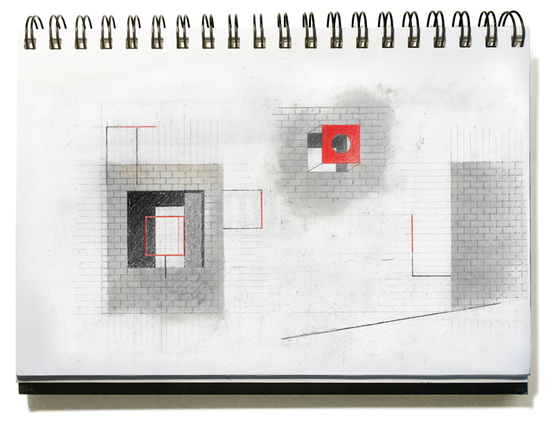 Now that the computer has almost totally marginalized the architect's pencil, we watch
warily as AI enters the scene. Is this going to increase or cripple human creativity? My
knowledge of the computer world is limited, having left all that to my younger staff over
the years while I've continued to tease out architecture with a pencil. I do love the way
the computer can take a vague little sketch and magnify its essence. The thickness of
the pencil line relative to the small size of the sketch privileges spirit over precision,
revealing in these scribblings a mysterious power. Including such hand drawings in an
otherwise computer-drawn presentation seems to light the client's way into a project.
I also appreciate what electronic construction drawings have done for us across the
board. But at the same time I've noticed that on the rare occasions I've had to give
contractors a hand drawn detail for expediency sake, they quieten, and look at it closely
with what can only be described as a sort of reverence. After this the contractor
generally seems more in tune with what we're trying to achieve. I believe the human
touch is still significant, whether of the hand or the mind.
The human touch carries with it something from beneath our consciousness, some
instinct or yearning breaking through. A bit of this elusive realm seems to want to be
involved with the making of architecture, if we would only slow down enough to let it in.
When we do, architectural grace notes arise. They take the form of spaces or details or
maybe even just a particular slant of light that for a moment gives us a sense of
homecoming. There are many different ways to accomplish this. In my own modest
work, bringing nature into play architecturally seems to be the key. I know that rainfall,
sunlight, breezes, or the passage of clouds may seem to be utterly beside the point of
most projects, yet strangely these things can sometimes deepen a building's meaning
and presence in our lives. Here are some specific examples of this:
Rainfall
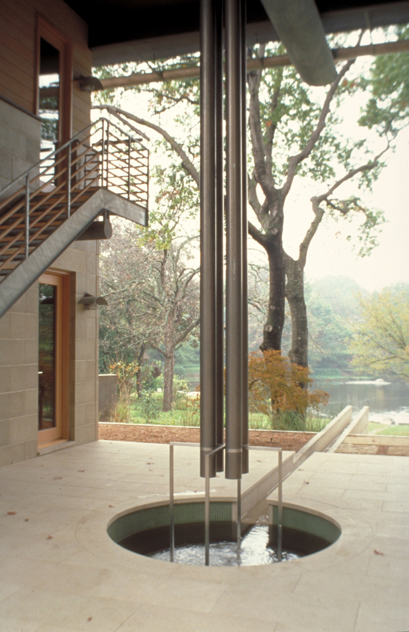
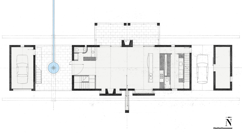
We did a house on a site with a lovely view of a quarry pond. All the rain falling on the roof of this house is channeled to a rain pool centered on an entry terrace. Gutters are held down a foot below the eaves so that rain coming off the roof can be glimpsed from the interior. The entry terrace is a breezeway, a twenty-two foot cube of space that frames the view of the pond. When it rains the pool overflows into a runnel which cascades down a hillside to the pond. One has a sense of the house being a part of the rain's path from sky to pond. There is something soothing in this awareness. The gutters, downspouts, rain pool and runnel, become a sort of poetic apparatus that quietly brings nature's ebb and flow to mind whether it happens to be raining or not.
House on a Pond
Dallas, 2001
Sunlight
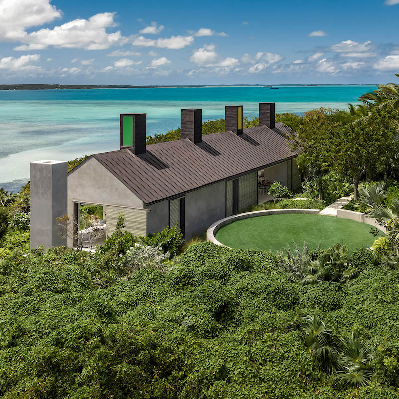
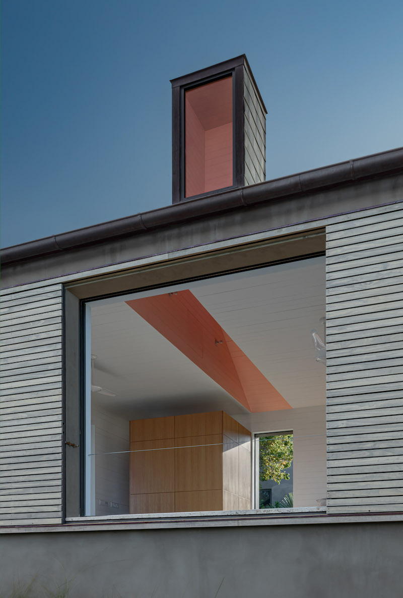
This house in the Bahamas acknowledges the island's profusion of color (landscape, seascape, skyscape) and the clarity of its sunlight. Four “light chimneys” are spaced along the ridge of the roof. These forms, glazed on one side, each face a different compass direction. Inside, they fan out into painted lightwells: yellow for the east-facing light chimney, green for south, pink for west, and blue for north. Over the course of the day these lightwells brighten and dim in unison with the sun's journey. The changing glow of these colors become an extension of the chromatic pageantry seen through the windows.
Bahamas Cottage
Harbour Island, Bahamas, 2023
Breezes
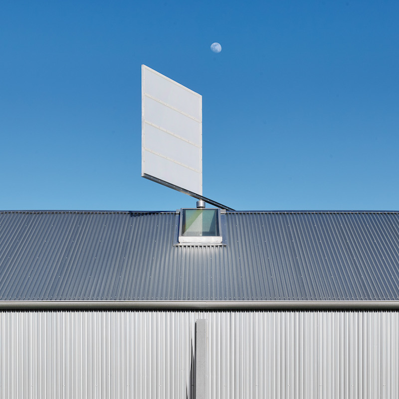
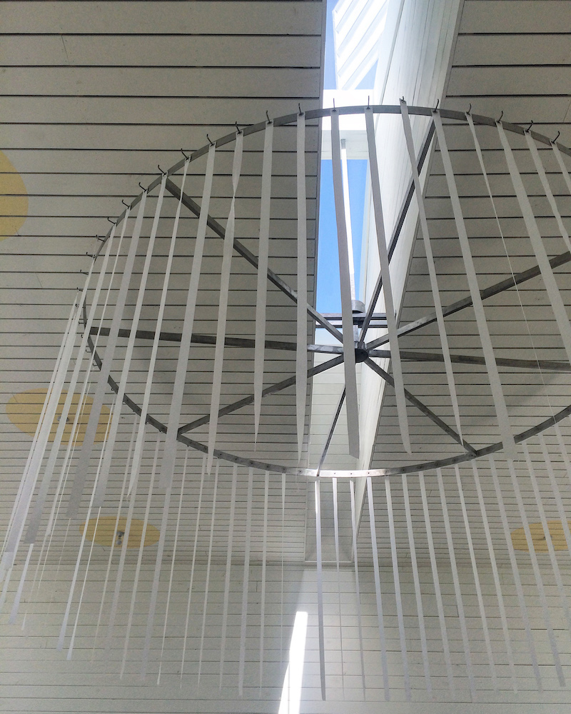
This wedding venue building stands on a nineteen acre site of rolling native prairie. One notices the breezes here and this building takes notice of them too. There is a large windvane on the roof, its vertical mast extends down into the main hall and supports a twelve foot diameter ring. This ring serves as an armature which can be decorated for festive occasions. Because the metal sail of the windvane is perforated rather than solid, its response to the changing wind currents is languid. Surprisingly, when winds are strong the ring is rather still, but when the breezes barely stir, the ring turns subtly and pauses in near constant animation. These silent movements overhead seem somehow to connect the activities inside the hall with the wider world outside.
Prospect House Wedding Venue
Dripping Springs, 2015
Clouds
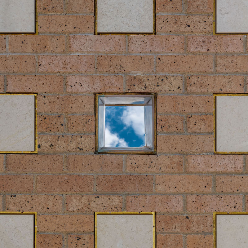
The site for this columbarium is a level lawn framed by mature oak trees. These trees also frame a view of the sky. Ashes of the deceased are placed in bronze urns, set within masonry niches, and sealed by engraved stone plaques. Some of the niches appear to have been left open, but upon closer inspection they surprisingly hold views of the sky and passing clouds. A bronze box, open on the ends, extends through the wall and out the back side. It contains a stainless steel plate polished to a mirror finish and angled at forty-five degrees, conveying live sky views into the niche. These open niches spiritualize the masonry walls with flashes of blue and white and gray.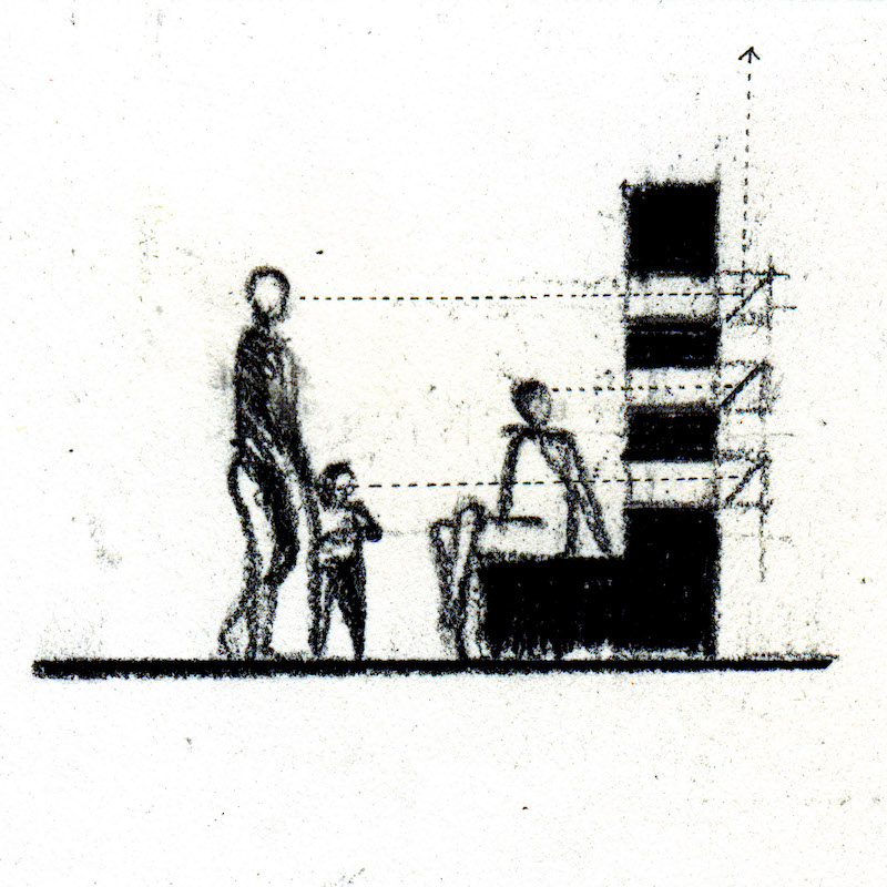
Grace notes require a particular type of attention to proportion, placement, detail, and editing. The study of architectural proportions was once central to architects' educations. Indeed, rules about such calibrations largely defined historical architectural styles. With a few notable exceptions, the improvisational quality of Modernism freed us all to handle measurements as we wish. Today we are pretty much left only with intuition to guide our sense of proportion. I have found that patiently tinkering with the size of things is key to luring the elusive into play. Too large, and the “poetic apparatus” becomes too visually loud for the quiet effect desired. Too small, and its stature is insufficient to inspire the overall atmosphere of a building.
As with proportions, axes through buildings were once very much a part of architecture's character and meaning. Today we tend to forget how potent a simple axis can be in dramatizing a view or a floorplan. Placement relative to a building's axes is key if a poetic effect is to beckon.
Details which delineate grace notes are a delicate matter. We architects tend to get so enthused about our design details that we over-emphasize connections and fasteners and the scale of things. But when that happens the detail becomes more about itself and less about the subject at hand. Usually, the simpler the “picture frame” the better, and the quieter its surroundings the more penetrating the experience. The Irish poet Michael Longley has said, “I do feel that a poem needs not just space, but, ideally, space around that space – space for meditation, reverie, subliminal link-ups.”
Finally, trying to capture the elusive in architecture goes beyond anything clients generally request in a program. We rightly tailor buildings to their programs' functional requirements. But we have all seen increasingly how functions change over time, and sometimes disappear altogether. What endures however are the grace notes, dealing as they do with timeless matters. In the long run, I think it's fair to say that peoples' favorite things about a building are often its elusive qualities.
